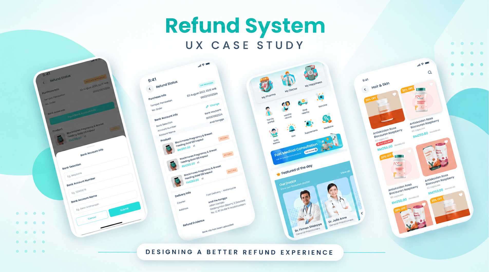
Nadi Refund System UX Case
Transforming traditional medical service refund workflows into a seamless semi-automated experience.
Role
UX Designer
Timeline
August 2022
Responsibilities
Wireframe, User Flow, UI Design
Product
Nadi Health (MVP)
NADI strives to enhance healthcare delivery through a digital platform for better and more accessible healthcare. Already operating offline in Malaysia, Nadi set out to build a medical app that handles the end-to-end journey, from doctor consultation until the medicine arrives at the user’s door.
This refund system helps the finance admin move the refund process from fully manual to semi-manual, managed by the system, preventing human errors that waste real money and impact the company’s financial flow.
The Problem
The existing refund procedure was fully manual: WhatsApp for communication and Microsoft Excel for data storage. It was error prone, difficult to manage, and made user information hard to find.
The Goal
Make the procedure semi-manual so admins can easily reach users, the system stores the data, and a step-by-step flow (using the Zeigarnik effect) shows the right information to both customers and Nadi admins.
I gathered information from the team using the existing procedure: how they used it, what was difficult, and how they thought it could be better. I aligned with the engineering team on constraints and limitations, then validated lo-fi and hi-fi designs with the product team and product owner.
Pain Points
- Communication media is not simple
- Refund status, payment evidence and user data are not stored in one place
- Not well organized, Excel must be updated after every conversation
- Must manually check which users already gave their bank account info
- Human-error prone: manual contact and manual updates
- Hard to sort users who have or haven't been refunded
Gains
- User data is organized in one system
- Bank accounts and refund status are easy to manage
- Filter users that are not yet refunded
- Chat with users directly from the system
- Approve, reject and sort refunds via the system
All refund data needs to live in one place. The system can ask users for their bank account, let them input it, and surface it on the admin screen. Together with the other teams, I designed a new flow and system so every refund scenario is prepared for.
Order Detail
Tapping a product in Activities used to jump straight to track & trace. I added a new Order Detail screen in between, with refund status and track & trace entry points, so users have one clear place to start.
Notification
Notifications report order progress, track & trace, and refund status. Tapping one deep-links to the relevant screen, while Activities leads to Order Detail with delivery status, partially refunded products and the refund status button.
Partial Product Refund
When the warehouse admin rejects an order, the system initiates a full refund. If only some products are unavailable, unchecked items are flagged for refund on packing, and the mobile order detail updates each product's status.
Iteration
In lo-fi testing the delivery status sat too close to the refund flags, which could mislead users into reading it as part of the refund. I moved the delivery status to the top of the screen.
